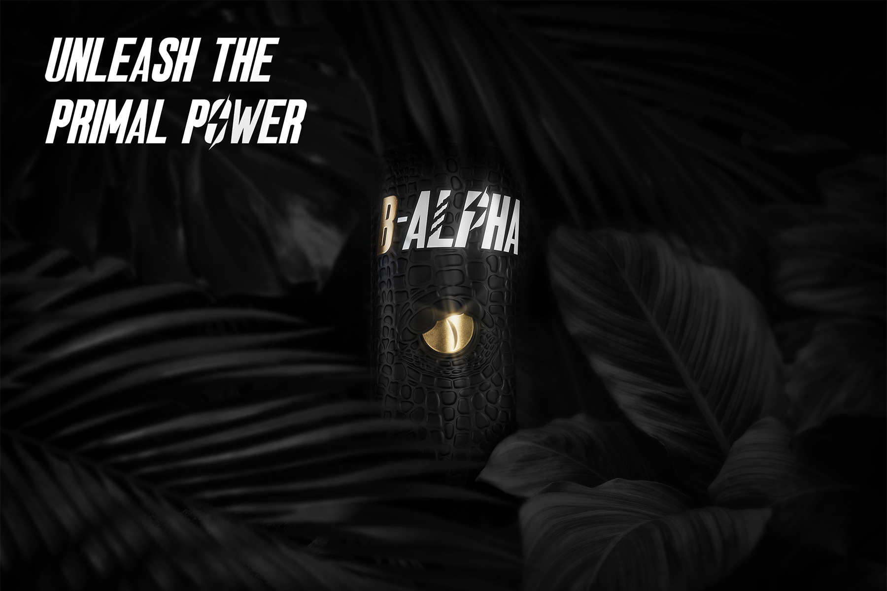
B-ALPHA was born with the goal of exploring new visual and sensory codes, transforming the energy drink from a mass-market product into an object of cult that communicates power, control, and instinct through design.
From a simple question “what if an energy drink could convey inner power as well as physical energy?” a concept emerged that unites naming, branding, and material into a visual and tactile ritual.
The name operates on two levels: “Be Alpha” as an invitation to activate one’s own strength, and “B-ALPHA” as an elite identity, the code of a creature designed to win. A name that becomes both a mantra and a manifesto of power.
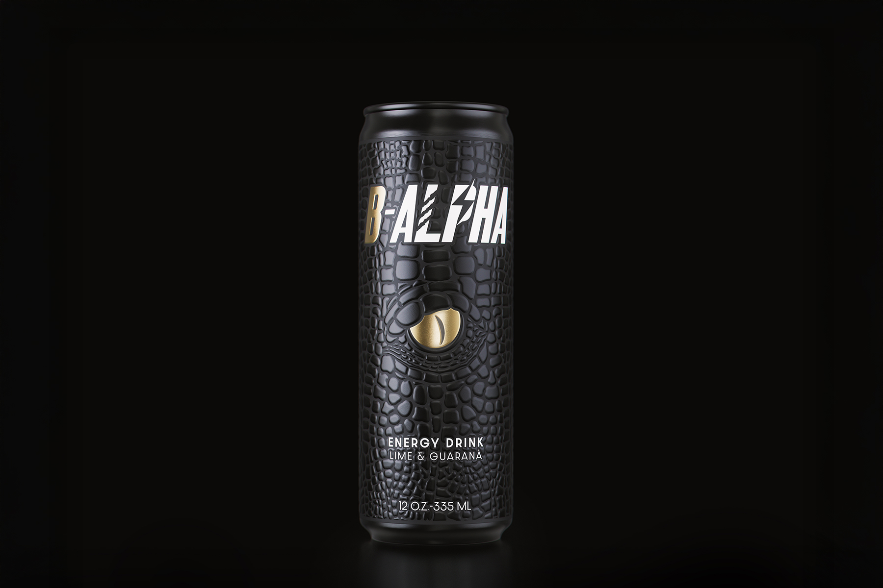
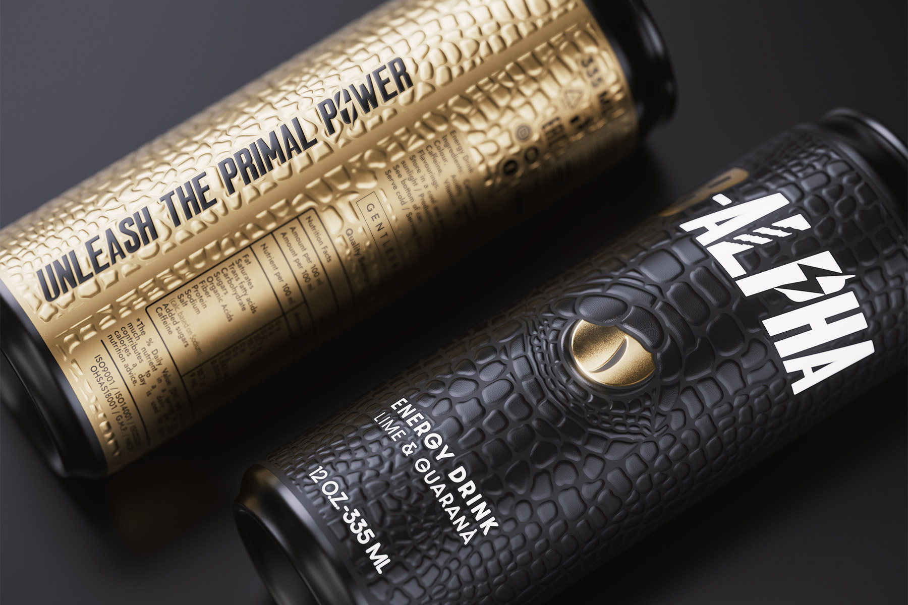
The can abandons the fluorescent codes typical of the industry in favor of a premium, sensory direction: a reptile-skin effect texture, created with embossed screen printing on soft-touch black polypropylene, and a golden eye in KURZ Luxor 431 foil, symbolizing the awakening of alpha energy. The contrast between matte black and metallic gold transforms the packaging into a totem of energy and power.
With B-ALPHA, we explore the trend of “Tactile Power & Premium Energy”: touch as the language of the brand, and packaging as a multisensory experience.
A project that redefines the energy drink and demonstrates how, for us, design can become tangible energy.