A new packaging for Col di Vite: a journey through vines and values with Italian elegance
Col di Vite was born from a deep love for the hills of Veneto, where the vine finds its ideal habitat and humans an inexhaustible source of inspiration. The name itself has a double meaning: "Col" refers to the gentle hills of the Prosecco DOC Treviso area, while "Vite" symbolizes life, relationships and resilience.
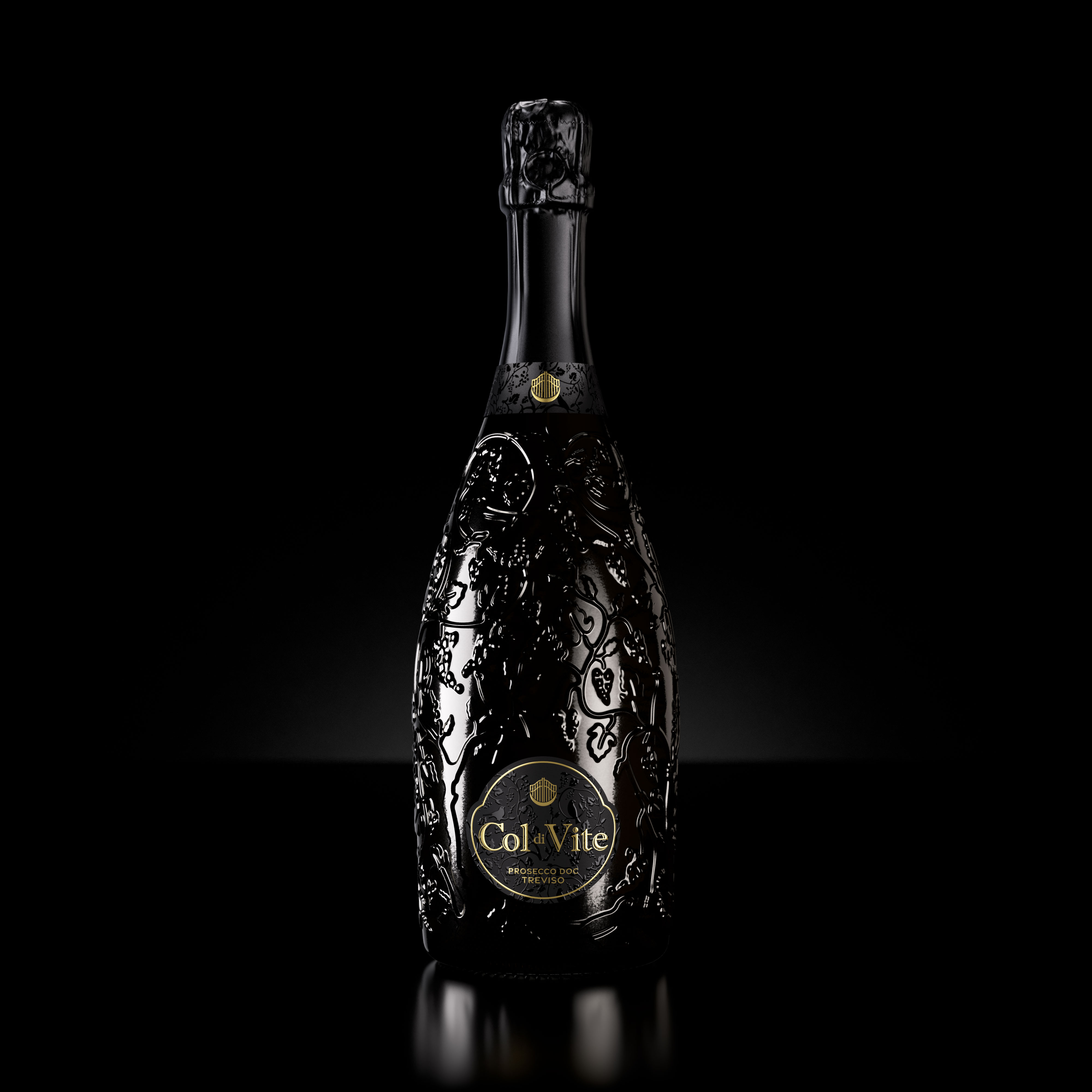
The premium glass bottle, with its elegant and sinuous shape, seems to emerge from the vineyard, while the texture is reminiscent of intertwined vine branches, symbolizing a deep connection with the land and the winemaking tradition.
The shape of the label resembles a padlock, symbolizing access to a 'secret garden'. A stylized padlock on the label, inspired by the gate to this enchanted space, serves as the entrance to a fascinating and mysterious world, inviting one to discover the beauty of nature surrounding the vineyards.
UV printing on UPM OPALUX ICE PREMIUM paper creates a play of light and shadow, evoking the natural brightness of the garden and revealing the mystery that each bottle holds.
Every element of the packaging has been designed to convey elegance and authenticity, an icon of Italian style that invites you to discover what lies behind each sip, while celebrating the territory that makes it special.
The Col di Vite collection is dedicated to those who seek a wine capable of enriching every moment: from an elegant dinner to a spontaneous toast with friends. It is therefore a vision of the future: a future in which experience is in dialogue with continuous research, where wine is not just a product but an experience capable of creating bonds.
Because every vine has a story, and Col di Vite is here to tell it.