PEARL ON THE TAIGA is a project born from the goal of creating a strong, distinctive, and refined visual and structural identity for a sparkling mineral water with a high mineral content. The naming immediately evoked the powerful and evocative image of a natural treasure set in the heart of Mongolia: a “pearl in the Taiga.” Gentlebrand translated this vision into a design capable of conveying exclusivity, authenticity, and a deep connection with the land of origin.
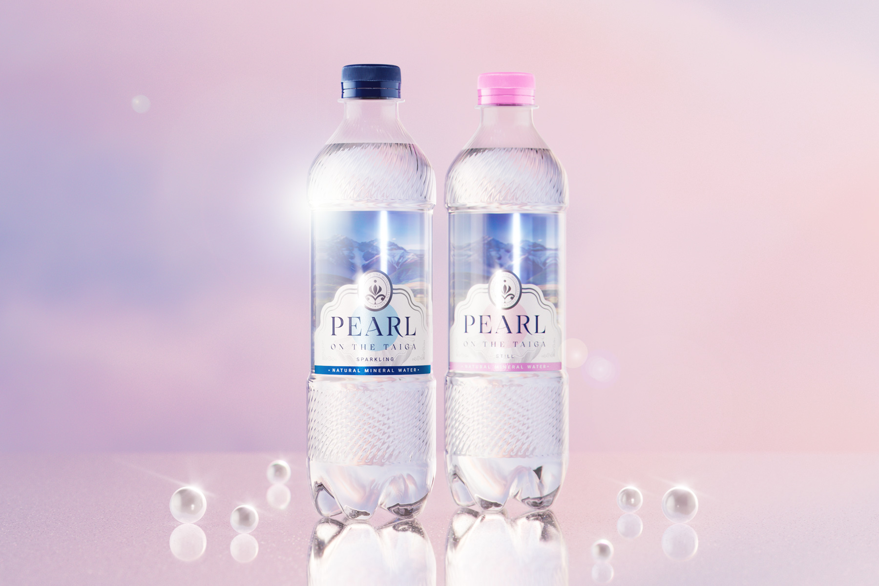
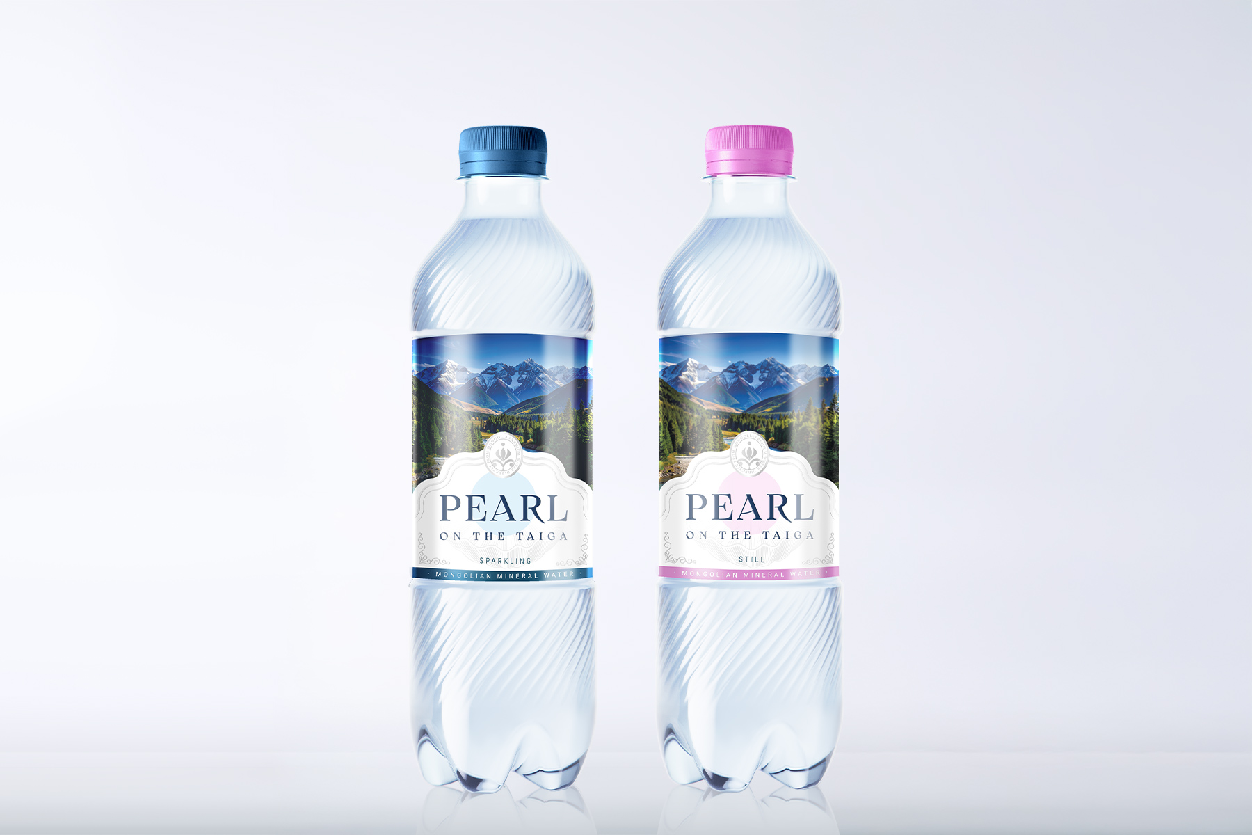
Every detail was carefully designed to reflect the purity and premium value of the product. Starting from the structural design, we developed a 500 ml bottle with an elegant and iconic silhouette, enhanced by “reebs swirl” decorations that interact with light, creating refraction effects inspired by the reflections of water and the glimmers of ice. The cap, coordinated with the label’s color palette, contributes to a harmonious and coherent overall image.
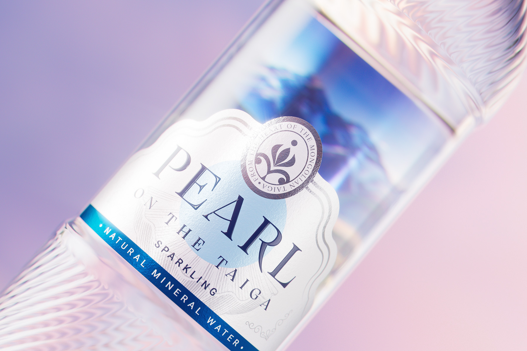
The label design was also conceived to tell a story. We chose a double-label solution that creates a refined visual effect: the back label, printed on transparent PP Clear material, depicts a typical Mongolian Taiga landscape visible through the bottle, positioned to become the perfect backdrop for the front label. The front label, made of moisture-resistant paper, is enriched with silver foil details and UV varnish that emphasize the brand’s premium quality while enhancing its details with elegance and subtlety.
Pearl on the Taiga is the result of an integrated creative process in which aesthetics, functionality, and storytelling merge to bring to life a distinctive and sophisticated product, perfectly aligned with the heritage and landscape of Mongolia. It exemplifies how design can enhance brand identity and transform mineral water into a high-end visual and sensory experience.