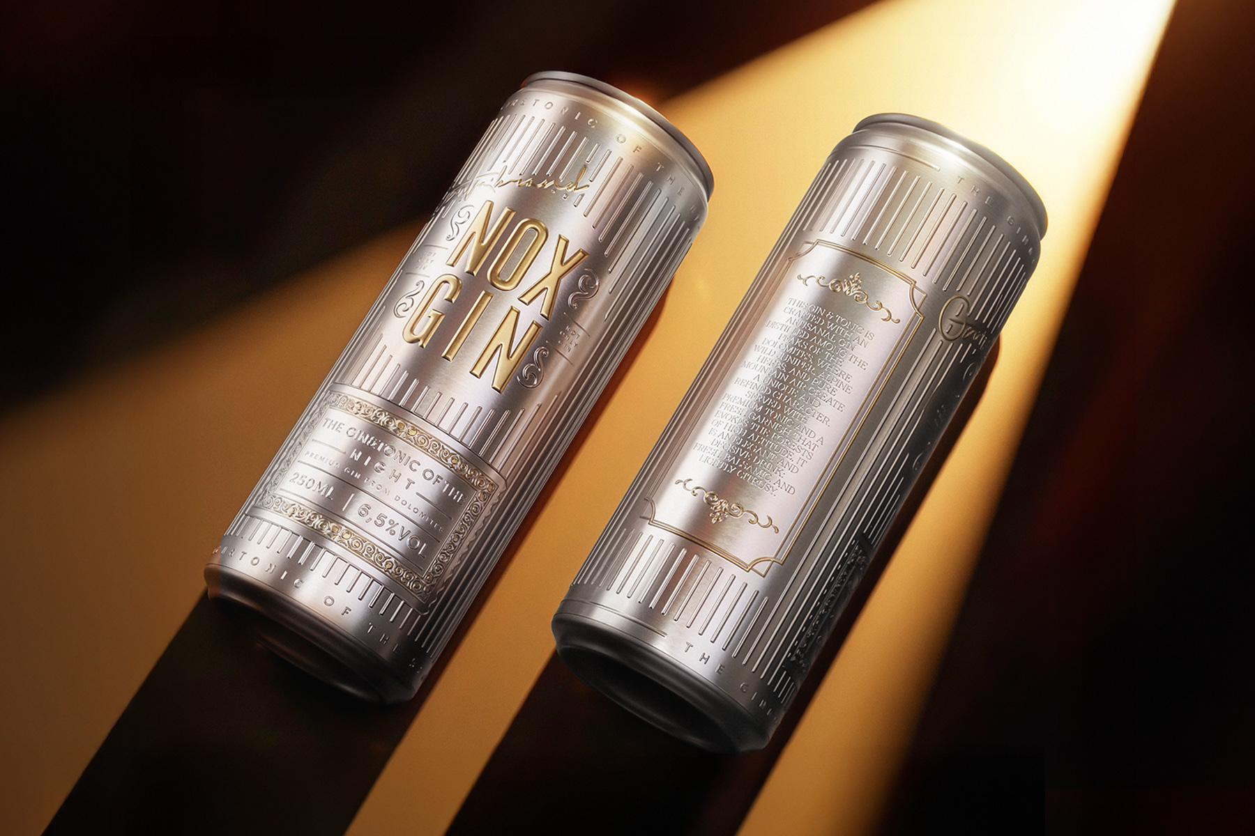
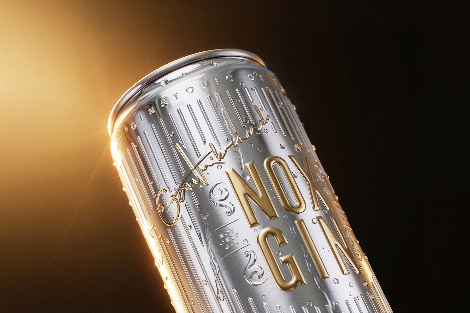
In the world of canned ready-to-drink cocktails, packaging is often confined to a mainstream look and feel due to the constraints of print decoration. However, with Nox Gin, Gentlebrand has turned this logic on its head by dressing the can in a label that enhances its decorative potential. This not only elevates the perceived premium quality, but also moves beyond pure 2D graphics to create structural decorations that can be felt through the print. Colours and application have also been reconfigured.
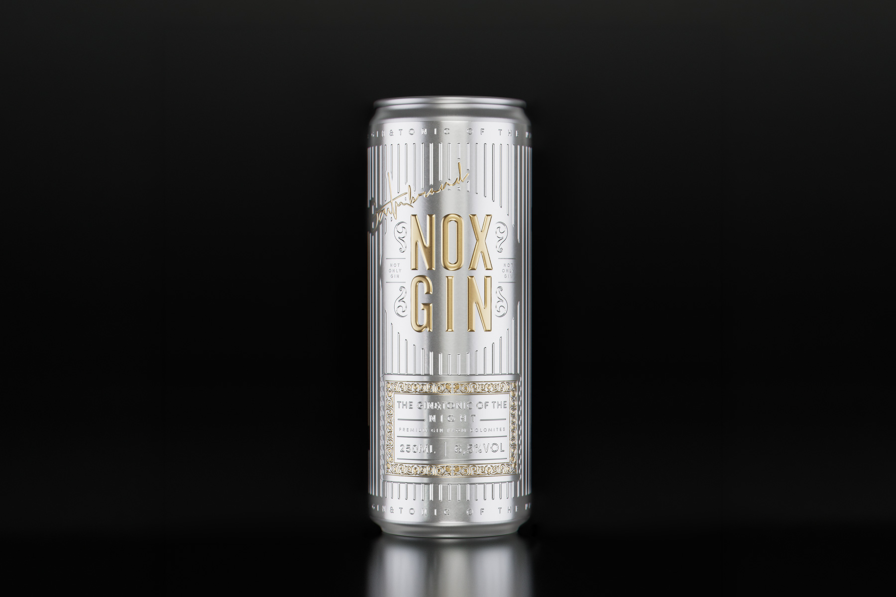
Developed as a premium 250ml ready-to-drink gin and tonic cocktail, Nox Gin stems from the idea of elevating the perception of ready-to-drink cocktails, which usually resemble CSD products, to the premium status typically associated with spirits. The result is packaging designed to stand out immediately, combining design, texture and visual identity.
The can uses a metallic substrate designed to blend with the primary packaging, while a minimalist choice of colours and finishes enhances the premium quality of the metallic finishes. The project is completed by a label with a high sensory impact featuring embossed details and foils, designed to enhance the user experience through a combination of tactile and visual effects.
Drawing inspiration from the vintage style of the 1920s, the design is reinterpreted through a contemporary lens. It strikes a balance between glamour and modernity, creating a strong, distinctive image that sets it apart from traditional cans while evoking the visual language of the spirits category.
Nox Gin demonstrates how packaging can be a strategic branding tool and a visual and tactile experience that can redefine a product category (ready-to-drink cocktails), shifting it from the mainstream perception of the CSD world to the premium spirits segment.